


The Two Month Rebrand
The Two Month Rebrand
Info
After making the move to help shape the future of the brand, I joined a newly formed creative team of two, tasked with rebranding a $2 billion company in just two months.
Working closely with my creative counterpart, I helped drive the transition from a blue and white palette to a more modern lumen and grey, removed the legacy shovel logo in favor of a clean word mark, and introduced the chevron as a core storytelling element. I contributed to updating all document branding, creating a new video bookend, and developing a collage-style graphic system to support visual storytelling. Alongside this, we concepted and built out the “Secure Every Second” campaign.
From strategy to execution, we collaborated directly with key stakeholders including the VP of Marketing and investors to deliver a bold, cohesive, and scalable brand evolution.
Role
Role
Branding
Branding
Art Direction
Art Direction
Client
Client
Sysdig
Sysdig
More
projects


Campaign
/
Graphic Design
The /555 Benchmark Campaign
Branding
/
Art Direction
Elevating RealSelf’s Social Brand
Graphic Animation
/
Graphic Design
Revealx Launch Video


Web Design
/
UX
Fresh Perspective to the LCN
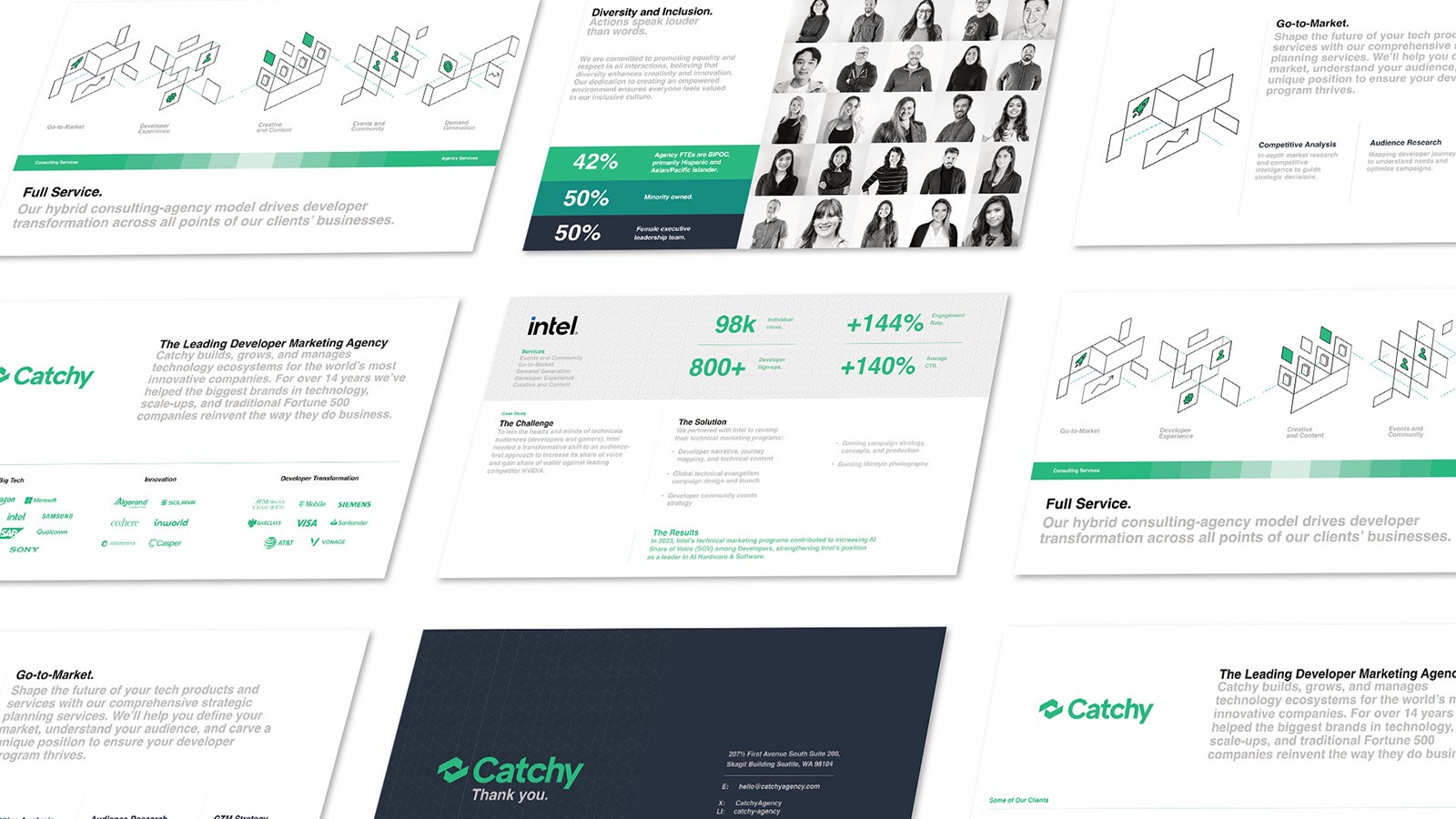

Graphic Design
/
Art Direction
Rescuing the Redesign


Branding
/
Video, Audio
Creating a Memorable Intro

Graphic Design
/
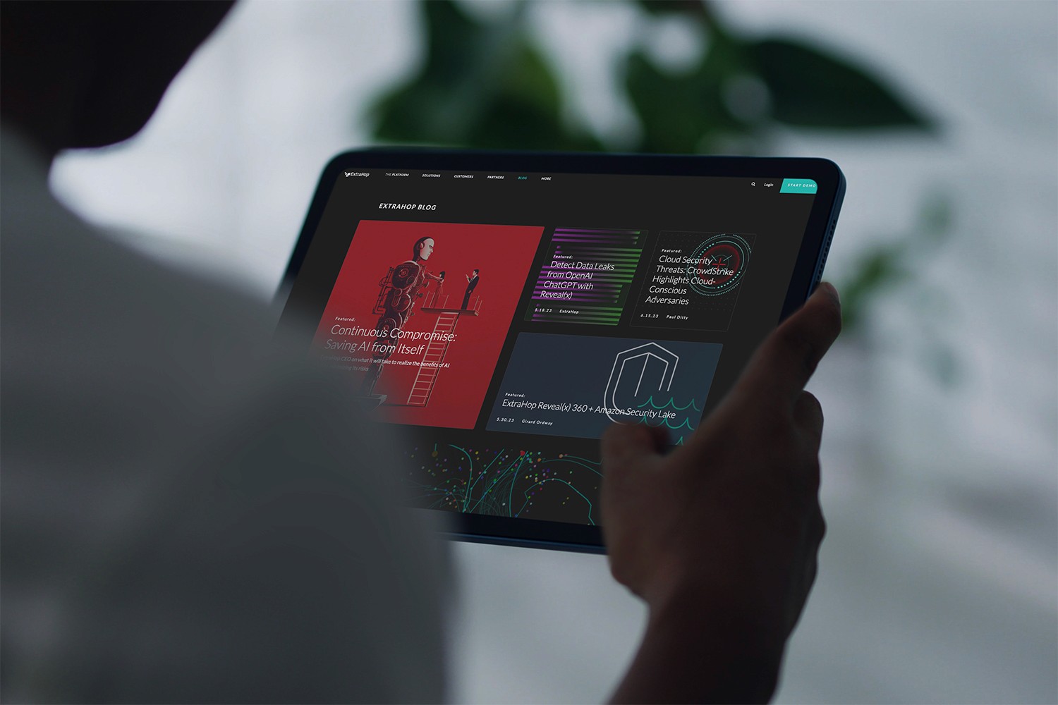
UX
Fixing What Didn’t Work
Graphic Animation
/
Art Direction
BlackHat Red V Blue


Graphic Design
/
Art Direction
Roam Launch & Evolution
Sr. Designer
Extrahop Archive

The Daily-Evil_WIP


Campaign
/
Graphic Design
The /555 Benchmark Campaign
Branding
/
Art Direction
Elevating RealSelf’s Social Brand
Graphic Animation
/
Graphic Design
Revealx Launch Video


Web Design
/
UX
Fresh Perspective to the LCN


Graphic Design
/
Art Direction
Rescuing the Redesign


Branding
/
Video, Audio
Creating a Memorable Intro


Graphic Design
/
UX
Fixing What Didn’t Work
Graphic Animation
/
Art Direction
BlackHat Red V Blue


Graphic Design
/
Art Direction
Roam Launch & Evolution
Sr. Designer
Extrahop Archive


The Daily-Evil_WIP